Your shelf · Set in OpenDyslexic · Tonight
Dyslexia reading app — OpenDyslexic and read-along audio
Concrete things first: the OpenDyslexic typeface is available on every book in the catalog, the type scales as large as you like, there are three calm themes including a high-warmth paper, and the audiobook can read along so eyes and ears split the work. None of it is a separate mode, none of it costs extra, and switching takes two taps.
Wuth. Hts · Ch. I · OpenDyslexic
What a page looks like
This is the opening of Wuthering Heights set in OpenDyslexic on the Refined Dark theme, speaker colors on — a real render, not a mock-up. The heavy letter bottoms are the typeface’s signature; many readers find it keeps letters from flipping and lines from swimming. If it does nothing for you, the serif and system faces are one tap away — it is a menu, not a commitment.
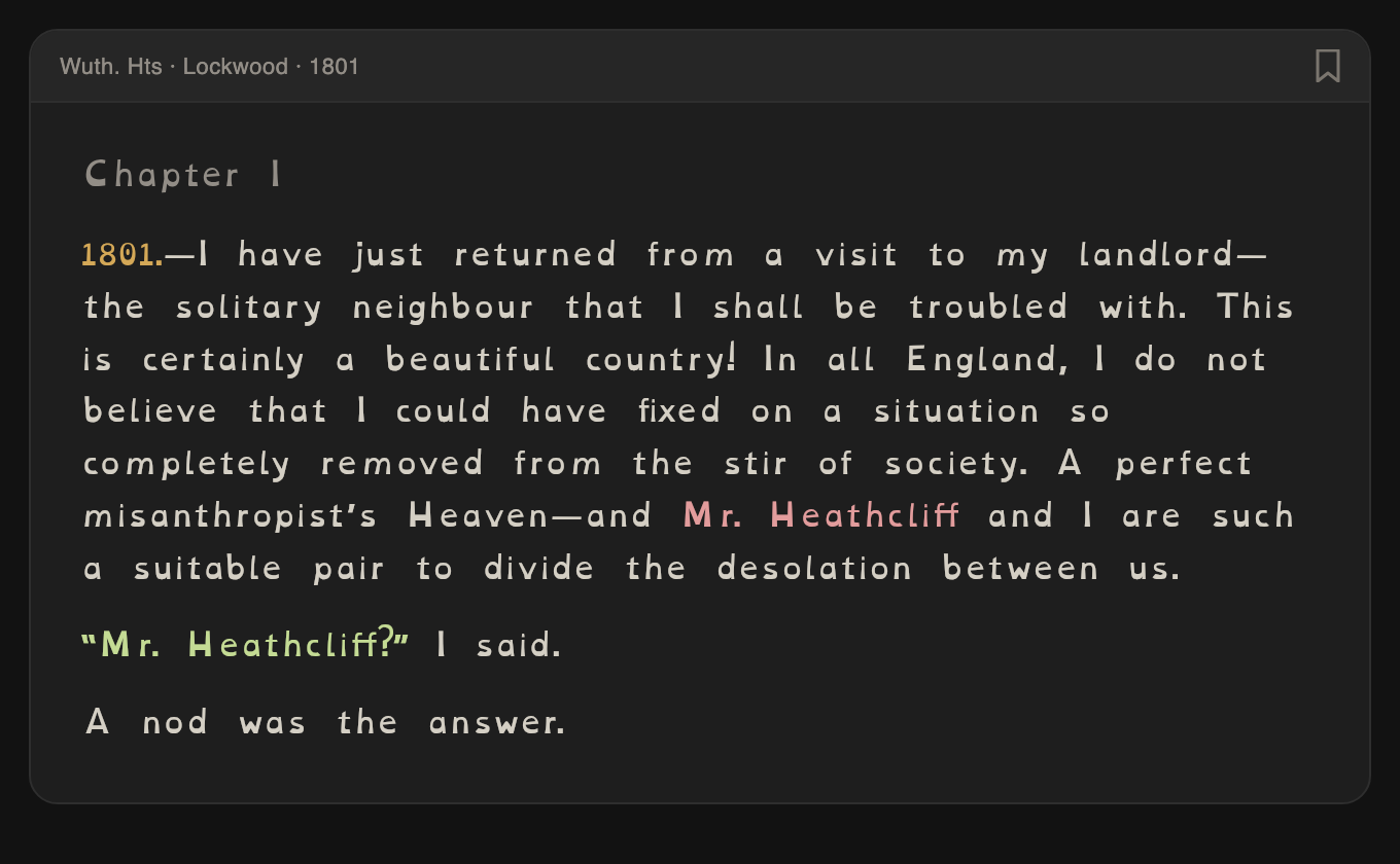
Chapter I, as the app renders it with OpenDyslexic selected.
Your shelf · The rest of the kit
Five things, each small, that stack
- OpenDyslexic everywhere. Not on a special shelf — every book, including anything a Pro member has had made on request.
- Type size without penalty. Scale up and the layout re-flows; the page count adjusts and the audio sync follows. Nothing breaks at large sizes.
- Three quiet themes. Refined Dark, Warm Paper — a low-glare, high-warmth cream many readers find gentlest — and Soft Light. All three keep the same verified contrast for every speaker color.
- Audio that reads along. Complete LibriVox recordings matched page by page, 1× to 2×. When decoding is expensive, the narration carries the line and the eyes confirm it — details on the read-along page.
- Colors that make lost places cheap. Losing your line costs less when the paragraph you need is the teal one. Speaker colors and the scene banner mean recovery is a glance, not a re-read.
Your shelf · The font shelf · Five faces
Five faces, and the setting that matters more than any of them
The typeface menu has five entries, and they are all just entries — no upsell, no “accessibility mode” that turns half the app off:
- OpenDyslexic — the weighted-bottom face designed to stop letters rotating. Bundled with the app, so it works offline and in italics and bold, not just in the body text.
- Atkinson Hyperlegible — drawn for the Braille Institute to pull apart the character pairs that collapse into each other at speed: capital I, lowercase l, the digit 1; O and 0; b, d, p, q.
- Lexend — built around wide default spacing rather than novel letterforms.
- Charter and the system face — because plenty of dyslexic readers do best with an ordinary, well-cut book face and simply need it bigger.
And then the control that the research actually points at: line spacing, in three tiers — Compact, Normal, Relaxed. It is worth being straight about this, because most pages selling “dyslexia fonts” are not. The evidence for any specific dyslexia typeface outperforming a plain one is thin and contested; the evidence for spacing is not. Zorzi and colleagues (PNAS, 2012) found that simply increasing letter and line spacing improved reading speed and accuracy for dyslexic children, with no training at all — and several studies of purpose-built dyslexia faces have concluded that whatever benefit shows up is coming from the extra spacing baked into them, not the letterforms. So spacing sits beside the font shelf here rather than three menus down, and OpenDyslexic gets extra line-height headroom on top of whichever tier you pick, because its tall x-height needs it.
Which is a long way of saying: try the faces, but move the spacing slider first. And if none of it helps, let the narrator carry the line instead — that is the setting with the largest effect for most people, and it is free too.
Your shelf · Asked and answered
Quick answers
Does OpenDyslexic actually help?
For some readers, clearly yes; across controlled studies, the picture is mixed, and several found no advantage over a plain serif once spacing was held equal. That is why it is one of five faces here rather than the whole pitch. Try it for a chapter — you will know — and try the Relaxed spacing tier whether or not you keep the face.
Is it free, and does it cost extra?
The typefaces, the spacing tiers, the themes, and the read-along audio are all included, on every book, at no charge. There is no accessibility tier and nothing here sits behind the paid plan.
Which books can I read this way?
All of them. Every title in the catalog is a public-domain Project Gutenberg text, and the settings apply to the whole catalog rather than to a special shelf — start here.
Can I make the text bigger without breaking the audio sync?
Yes. Scale the type as far as you like; the page re-flows, the page count adjusts, and the audio stays matched to the words. Nothing degrades at large sizes.
Does it work with VoiceOver?
Yes, and it was built for it rather than patched for it. A page stays a single block of text, so the character, word, and line rotors keep working instead of fragmenting into paragraph scraps; three-finger swipes turn pages the standard way; and the speaker colors reach listeners as spoken names, so a change of voice is announced rather than lost. The app also takes its opening text size from your system setting.
What if my attention is the problem, not my eyes?
Different page: reading with a mind that wanders covers re-entry, scene banners, and losing the thread.
Your shelf · For the resource lists
For librarians and the people who make lists
If you maintain a resource page for readers who want classic literature with OpenDyslexic and synchronized audio in one place: that is precisely what this is, the relevant titles are all Project Gutenberg texts, the audio is LibriVox, and the featured books are free in full. Questions to hello@chromatics.mobile — a human answers.
OpenDyslexic, the warm theme, and a narrator who keeps your place — set once, then just read.
Start reading freeFree on iPhone and iPad. On Android? Leave an email.